So, without further adieu, Week 26:
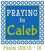
Here is what the spread looks like when you open to week 26. The first page is really all about my trip to St. Louis to visit with Desiré and Caleb. Please be in prayer for this sweet family. Caleb has come down with pneumonia while waiting on his new heart and needs to heal completely so they can move forward with transplant. Go HERE to read more of his story.
Here is the week layout without any inserts. The back page is all about the swimming we did this week. We have the best neighbors and they let us use their pool while they were away. The kids and I enjoyed two wonderful, lazy, sun-filled days splashing and playing!
Since we spent three days at the lake and I took a TON of pictures, I decided to use the smaller inserts to share about our time there.
I LOVE the instagram page protectors that include the 2x3 card for journaling!!!!
Front:
Back:
Front:
Back:
Front:
Back:
Front:
Back:
Front:
Back:
Yes, that's a ton of inserts. :) But I had a ton of pictures that I wanted to include. {Side note: how precious is the bottom picture of my mom and dad? Love them!!!!}
Project Life is amazing. I HIGHLY recommend it if you are looking for a way to scrapbook without losing your mind! :)
Linking up to The Mom Creative!


Very pretty! What kit are you using? Blush?
ReplyDeleteHi Sarah! Thank you! I'm using Blush...although I snuck in a card from the Childhood kit as well as a few from Midnight. :)
DeleteWonderful! I love how all the inserts kind-of make a mini-album within the album. :)
ReplyDeleteThanks, Jenny! You are so sweet!
DeleteI love the way you used the title card! and that photo of your parents is fantastic :-)
ReplyDeleteLovin' your pages, Jen! Hugs!
ReplyDeleteAh! Kristina thank you! I've stalked your pages and feel a little star struck right now! :)
DeleteGreat layouts. I love the picture of your parents and your handwriting is so neat!
ReplyDelete